Lesson 1: Introduction to Graphic Design – Foundations of Visual Communication
Welcome to Lesson 1 of your comprehensive design journey. Before diving into complex software like Adobe Photoshop, Illustrator, or Figma, a professional designer must first master the mental framework of design.
In this foundational lesson, we will dissect what graphic design truly is, strip away the misconceptions, and explore the core visual elements that make up every digital asset on the internet.
1. Deconstructing the Definition: Art vs. Design
The most common misconception is that graphic design is simply "making things look beautiful." While aesthetics are important, there is a fundamental difference between fine art and graphic design:
Fine Art is Expression: An artist begins with a blank canvas to express internal emotions, personal views, or abstract concepts. The interpretation is entirely up to the viewer.
Graphic Design is Actionable Communication: A designer begins with a specific problem, a target audience, and a clear goal. The success of a design is measured by how effectively it delivers a message and drives a user to take a specific action.
The Designer's Creed: "Design is not just what it looks like and feels like. Design is how it works."
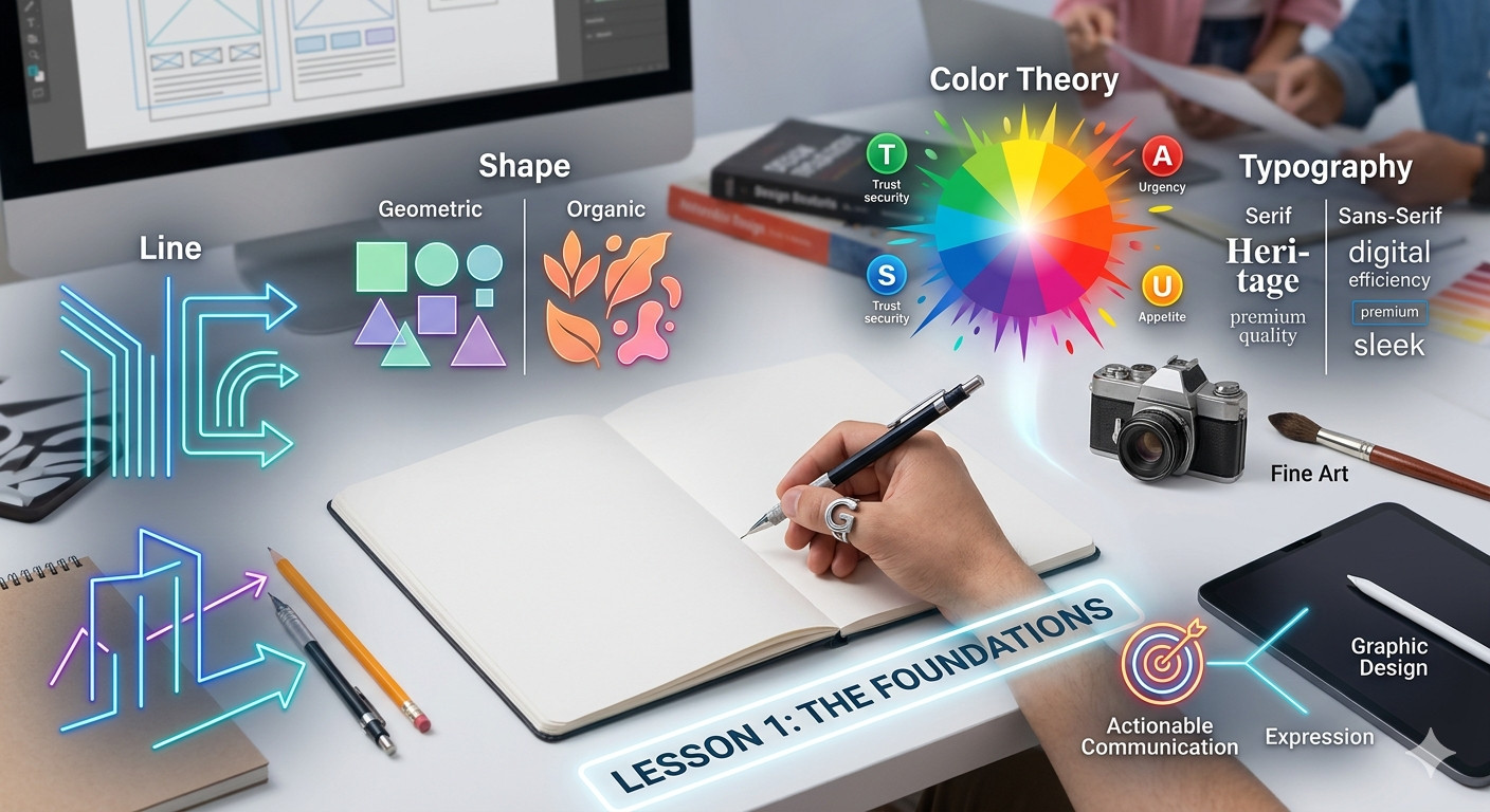
2. The Anatomy of Sight: 4 Core Elements of Design
Every banner, UI interface, application screen, and social media graphic you see in the digital landscape is built from the exact same structural building blocks. To create impactful visuals, you must master the first four fundamental elements:
A. Line
A line is the simplest element, connecting two or more points. Lines can be thick, thin, dashed, curved, or jagged.
Function: Designers use lines to create boundaries, divide space, direct the viewer’s eyes to a specific focal point, or evoke hidden psychological responses (e.g., vertical lines signal stability, while diagonal lines suggest movement and energy).
B. Shape
When a line closes or meets its own start point, it forms a shape. Shapes are categorized into two main types:
Geometric Shapes: Squares, circles, and triangles. These are structured, symmetrical, and communicate order, professionalism, and efficiency.
Organic/Natural Shapes: Free-form, asymmetrical shapes found in nature (like leaves or water splashes). These communicate creativity, comfort, and accessibility.
C. Color Theory
Color is arguably the most powerful emotional tool in a designer’s toolkit. It does not just look vibrant; it dictates how a user feels about a brand.
The Psychological Hook: Why do fast-food brands use red and yellow? Because they stimulate appetite and urgency. Why do banks use blue? Because it communicates trust, security, and authority.
Contrast and Hierarchy: Color is used to separate crucial elements (like a "Buy Now" button) from secondary background elements.
D. Typography
Typography is the art and technique of arranging type (text) to make written language legible, readable, and visually appealing when displayed.
The Font Personality: Choosing a font family is like choosing an outfit for your words. A clean, modern Sans-Serif font (like Helvetica or Inter) communicates sleek digital efficiency, whereas a traditional Serif font (like Times New Roman) conveys heritage, authority, and premium quality.
FAQ
What is the main purpose of graphic design?
The main purpose of graphic design is to solve communication problems and deliver clear, structured, and actionable visual messages to a specific target audience using elements like typography, shapes, and colors.
What is the difference between geometric and organic shapes in design?
Geometric shapes (circles, rectangles) are structured, symmetrical, and represent order and logic. Organic shapes are irregular, free-form, mimic natural elements, and represent creativity, warmth, and fluidity.
Why is color theory important in graphic design?
Color theory is critical because colors trigger immediate psychological responses and emotional associations in users. Masterful use of color establishes brand identity, builds emotional trust, and highlights important elements in a visual hierarchy.
Practical Assignment for Lesson 1
Look Around Your Digital World:
Open your favorite mobile application or browse a popular website. Identify one geometric shape, one specific color choice, and one font style used on the homepage.
Write a 3-sentence breakdown explaining why you think the designer chose those specific elements to communicate with you. Share your breakdown directly in the community comments below to get real-time feedback from your peers!